Understate
Understate is a brand concept that occupies the lowest condition of a strategic continuum ranging from the least intervention to the most (Saturate). In this understated condition, brand identity is subtly repetitive, minimally distributed spatially, and applied at a limited number of scales and elements. The understated interior relies on the strength of brand recognition to solidify the narrative of place. more
Understate | Spatial Graphic Design
research
In the broadest sense, graphic design represents a language of visual communication, adding layers of "complexity, nuance and subtlety"1 to the comprehension of whatever information is at hand. When introduced to an interior environment, the added spatial dimension coupled with these graphic elements takes this communication one step farther, making it an experience.
The Intypes research category Spatial Graphic Design defines a new sub-type of environmental graphic design that is interior-specific and based on the establishment of a spatial narrative of brand or theme. Spatial Graphic Design is a multidisciplinary approach that may include components of graphic design, industrial design, interior design and architecture. Applications of brand in interior settings relies on the interaction of various design elements to create layers of meaning, serving as a vehicle for the storytelling of the space's narrative of place. This narrative embellishes and reaffirms itself through varied use of material, color, lighting, and signage, among other design elements. The communication of an interior's brand concept or spatial narrative can be articulated in varying degrees, employing a range of communicative devices to make the expression more literal or more abstract, highly immersive or more discreet.
To understand this varied range of brand concept, the argument is made for three brand concepts or frameworks for analyzing or designing Spatial Graphic Design interiors-Understate, Activate, Saturate. This range is best understood as a continuum, spanning every increment level of narrative expression. Three nodes define this strategic branding continuum. Defining the two extremes (Understate and Saturate) and the median point (Activate) of this continuum helps to give structure to the larger spectrum of which they are a part. While understanding these three points helps to define the larger picture, it is equally important to see the continuum as part of, and as a means to, understand the full range of brand concept that can be articulated within a space.
Two archetypical strategic practices, Colorbrand and Repeat Repeat, punctuate the experience of space and may be used in any of the concepts.
To make the case for each category, the chronological sequence was limited to the very best exemplars. For Understate, in the 1970 to 2010 period, there are five examples representing the following practice types: bank, retail, showroom, workplace. Each photographic example is coupled with a visual analysis highlighting the dominant graphic components in the space that are used to articulate the brand concept.
Description
In the understated interior, typically one to two Spatial Graphic Design strategies or elements of graphic design (such as the use of Colorbrand2, a feature form, or a singular use of logo/logotype) are used to articulate the concept. Often, a powerful and singular instance of brand vocabulary is presented to set the tone for the rest of the space, which remains fairly neutral. Because of this context, these one or two elements become the features in the space.
In such spaces, less is indeed more when it comes to crafting an experiential narrative of place. Often, the function of the space dictates its level of brand application. In workplace settings, a bombardment of branding and marketing could serve as a distraction to employees, while a more understated presentation of brand helps to reinforce a sense of place without detracting from the space's function. In certain retail environments, the use of literal expressions of brand vocabulary are intentionally restrained allowing the products to be the focus of the spatial experience. In such environments, the brand name and its associated graphic vocabulary are established well enough that they can be used minimally and still communicate a strong sense of place and identity within the retail interior.
Chronological Sequence
New Jersey's First State Bank is a quintessential 1970s interior, complete with olive green carpeting throughout and white laminate for countertops, desks, and planters alike.3 The rest of the space's material palette is modest, with white floor tiles, several brick columns, and a few splashes of wood veneer. Although much of the décor is apt for a bank of its time, the First State Bank is not without an assertion of its individual identity. In a singular use of Repeat Repeat,4 the bank's initials, FSB, are tiled along the wall behind the bank teller stations. The raised block lettering runs horizontally down the full length of the wall, visible to patrons wherever they chose to stand along the teller counter. Although the logo is repeated multiple times in the string of letters, the application is far from overbearing. The letters themselves are the same matte white as the wall behind them, making the statement retrained yet effective.
In many retail environments, it is common for the products to be left to speak for themselves. One such space is the Kenneth Walker interior for designer Per Spook's Paris showroom-the picture of understated elegance. The Norwegian fashion house is known for its apparel that is both "graceful and polished but also witty and lively", making frequent use of bold prints and asymmetrical cuts.5 In designing the brand's showroom, Walker leans heavily on the strong image of the apparel itself, creating an understated interior that allows the signature pieces to take center stage.
A singular instance of the company name-the trademark whimsical black lettering set on a white square-is presented on the black wall behind the reception desk upon first entering the showroom. While the perpendicular mirrored wall serves to double the logo, it remains unseen in the remainder of the showroom. Black walls and black carpeting are carried throughout the interior, punctuated occasionally by a square black and white illustration on the walls, white task chairs, and, of course, the brand's colorful clothing. The use of the logo's diametric colors create a spatial experience that is both minimalist and dramatic, allowing the vibrant couture to stand as the showroom's focus.
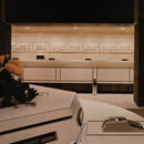
Spare of even its signature Knoll red, Lee Stout's design of furniture company's Brussels showroom offers a minimalist approach to showcasing the well-known brand.6 Entering the space, visitors are met by a massive, columnar element that is uniquely geometric, bearing the Knoll name in raised white lettering. The piece's substantial size, countered by its matte white finish, matches the bare walls of the showroom. The rear plane of this statement piece is canted at about 30 degrees, a distinctive touch that is replicated on the interior wall running opposite the windows of the building's façade.
These unique structural geometries aside, the space is furnished sparingly and devoid of any color, unusually subtle for the brand whose signature red is so widely recognized. After the initial presentation of the company name, the brand's only other expressions in the space are by way of the furniture. Tasteful selection of Mies van der Rohe's Barcelona chairs and couch, all upholstered in tufted black leather, make for a stark, elegant contrast against the interior's white walls. Surrounding a large desk at the far end of the space are several Eames executive chairs, also in black leather. The use of such iconic, high-end seating is a thoughtfully calculated design decision on the part of Stout, aiming to solidify the association between the Knoll name and such coveted pieces of furniture.
In a similarly demure workplace in New York City, designer Tom Krizmanic of Studios Architecture crafts a glowing office for small investment firm VennWorks.7 A singular introduction of the company's logo as an oversized mural in the space's lobby gives way to a much more sedate palette of concrete slab flooring, brushed stainless steel and softly lit white walls. Indeed, it is the lighting that made this space so spectacular. Taking every advantage of the peaked roof on the upper level of the 1920s commercial building, Krizmanic implements three massive, 75-foot square skylights, illuminating the space below with soft daylighting. In the lobby area, a large, backlit acrylic pane serves as a faux skylight, adding the illusion of height to the 9-foot ceilings. Perimeter offices are separated from corridors with etched glass, providing privacy and also reflecting light from the building's façade into the space's core. Save the lighting, the office's material palette is neutral and modest. Moments of color are reserved the golden yellow of the larger-than-life logo and a set of chairs arranged in a double-height seating area, upholstered in the same company color.
First developed in the late 1980s, Red Bull fast becomes an internationally popular energy drink. Expanding its aggressive marketing campaign ("Red Bull gives you wiiings!") to include celebrity endorsements, sports team ownerships, and tournament sponsorships, the company even boasts its own record label. Closely associating itself with the rapidly growing arena of extreme sports, Red Bull sponsors everything from motocross and snowboarding to cliff diving and Formula 1 racing. This is a logical partnership for the energy drink that stakes its claim as a "functional beverage", enhancing focus and performance.8
The brand's logo, two red bulls sparring, comes as a derivative of the Thai energy drink Krating Daeng that inspires the company's own product; daeng meaning red, krating being a reddish-brown bovine slightly larger than a bison.9 Despite the company's widely popular marketing tactics and iconic logo, the company takes a considerably less brand-heavy approach in the design of its Los Angeles headquarters.
Taken on by a design team at HLW, the project turns more heavily to the sporting analogy so oft associated with the brand than to the company's own visual identity. Not a bull to be seen and only a brief moment of red in the space's café, the interior is a wash of charcoal grey carpeting, white laminate, brushed aluminum and a warm, sienna colored paper-resin. It is this paper-resin composite that makes up the interior's most notable feature-a massive ramp, undulating in 15-foot-high arcs anchored in beds of river rock, running almost the entire 500-foot length of the interior. A nod to the ramps found in skate parks, the massive structure aptly transforms the 100,000 square-foot brick warehouse into a corporate playground for the spirited company.
Nestled under the apex of one of these sweeping arcs is the staff café; glass-fronted conference rooms were tucked beneath others. Surrounded by clusters of workstations, the ramp eventually flattens out to become the floor of a 125-seat theatre, finally terminating in the curve of the theatre's canopy. The distinctive feature can be viewed in its entirety from the mezzanine level that also houses a boardroom, private offices and additional workspaces. Although the vocabulary of highly recognizable colors and icon of the Red Bull logo are noticeably absent from the workplace, the one-of-a-kind ramp feature form is remarkable enough to make a name for the headquarters all on its own.
The understated interior can be effectively implemented in many practice areas, offering an experience of brand narrative that can be simultaneously restrained and also quite dramatic in its minimalism.10
end notes
- 1) Alice Twemlow, What Is Graphic Design For? (United Kingdom: RotoVision, 2006), 6.
- 2) Colorbrand is a brand strategy characterized by the use of color in an interior space as an explicit representation of the space's brand identity. This color is most often derived from the company logo or graphic identity and is the principal color or colors used on an otherwise neutral interior palette. Juliana Daily, "Theory Studies: Archetypical Spatial Graphic Design Practices in Contemporary Interior Design" (M.A. Thesis, Cornell University, 2012), 44-66.
- 3) First State Bank [1976] Raymond C. Perko, Inc.; Toms River, NJ in Anonymous, "Setting The Scene," Interior Design 47, no. 2 (Feb. 1976): 97; PhotoCrd: Jaime Ardiles-Arce.
- 4) Repeat Repeat refers to the reiterative practice of using a graphic element, color application or spatial motif in multiple locations and/or scales within an interior space. This practice is implemented a means to reinforce an occupant's sense of place as well as to establish the interior's (brand) identity. Juliana Daily, "Theory Studies: Archetypical Spatial Graphic Design Practices in Contemporary Interior Design" (M.A. Thesis, Cornell University, 2012), 23-43.
- 5) Per Spook Fashion Showroom [1982] Kenneth Walker, AIA; Paris, France in Anonymous, "Study in Black and White," Interior Design 53, no. 1 (Jan. 1982): 199; PhotoCrd: Peter Paige; Kevin Almond and Mary Ellen Snodgrass, "Spook, Per," Fashion Encyclopedia, accessed 8 Jul. 2001, http://www.fashionencyclopedia.com/Sp-To/Spook-Per.html.
- 6) Knoll Showroom [1986] Lee Stout; Brussels, Belgium in Anonymous, "Knoll, Brussels," Interior Design 57, no. 7 (Jul. 1986): 226-227; PhotoCrd: Architekturfoto Engelhardt & Sellin (Munich).
- 7) VennWorks New York Office [2002] Tom Krizmanic, Studios Architecture; New York, NY in Monica Geran, "Wise Investment," Interior Design 73, no. 11 (Nov. 2002 Supplement): S44-45; PhotoCrd: Alberto Ferrero.
- 8) Red Bull L.A. Headquarters [2006] HLW; Los Angeles, CA in Edie Cohen, "Ramping It Up," Interior Design 77, no. 10 (Oct. 2006): 286-287, 289; PhotoCrd: Benny Chan, Fotoworks; "Home," Red Bull Records, accessed 25 Jun. 2011, http://www.redbullrecords.com/; "Red Bull Energy Drink," Red Bull Homepage, accessed 25 Jun. 2011, http://www.redbull.com/cs/Satellite/en_INT/red-bull-energy-drink/001242937921959/.
- 9) "Krating Daeng: Devising a Marketing Strategy for the Thailand Market," U21 Global, (accessed 25 Jun. 2011), http://www.u21global.edu.sg/portal/corporate/docs/AA-2009-002_InspectionCopy.pdf; "Red Bull," Wikipedia, (accessed 25 Jun. 2011), http://en.wikipedia.org/wiki/Red_Bull.
- 10) Evidence for the archetypical use and the chronological sequence of Understate in Spatial Graphic Design was developed from the following primary sources: 1970 / First State Bank [1976] Raymond C. Perko, Inc.; Toms River, NJ in Anonymous, "Setting The Scene," Interior Design 47, no. 2 (Feb. 1976): 97; PhotoCrd: Jaime Ardiles-Arce / 1980 Per Spook Fashion Showroom [1982] Kenneth Walker, AIA; Paris, France in Anonymous, "Study in Black and White," Interior Design 53, no. 1 (Jan. 1982): 199; PhotoCrd: Peter Paige / Knoll Showroom [1986] Lee Stout; Brussels, Belgium in Anonymous, "Knoll, Brussels," Interior Design 57, no. 7 (Jul. 1986): 226-27; PhotoCrd: Architekturfoto Engelhardt & Sellin (Munich) / 2000 VennWorks New York Office [2002] Tom Krizmanic, Studios Architecture; New York City in Monica Geran, "Wise Investment," Interior Design 73, no. 11 (Nov. 2002 Supplement): S44-45; PhotoCrd: Alberto Ferrero / Red Bull L.A. Headquarters [2006] HLW; Los Angeles, CA in Edie Cohen, "Ramping It Up," Interior Design 77, no. 10 (Oct. 2006): 286-87, 289; PhotoCrd: Benny Chan, Fotoworks.
bibliographic citations
1) The Interior Archetypes Research and Teaching Project, Cornell University, www.intypes.cornell.edu (accessed month & date, year).
2) Daily, Juliana Richer. "Spatial Graphic Design: Archetypical Design Practices and Theory Studies On Constructing A Narrative Of Place." M.A. Thesis, Cornell University, 2012, 67-79.