Repeat Repeat
Repeat Repeat is a brand strategy referring to the reiterative use of a graphic element, color application or spatial motif in multiple locations and/or scales within an interior space. This practice is implemented as a means to reinforce an occupant's sense of place and to establish brand identity within the interior. This strategy is generally used in conditions of elevated brand intervention (Activate, Saturate). more
Repeat Repeat | Spatial Graphic Design

research
Repeat Repeat relies on taking a singular visual element within an interior space and using it multiple times. This strategy can take on varying forms, depending on which element is being repeated and in what way. Most commonly repeated elements include a company logo or name, decorative patterns, and structural geometric forms, although others, such as repeated imagery/icons of a similar style, may also be included. Instances of Repeat Repeat are typically confined to a planar, two-dimensional application on a horizontal or vertical surface, or are a three-dimensional, geometric extrusion that is situated structurally within the space.
The earliest instances of Repeat Repeat are presented primarily through the recurring use of a brand logo or logotype. In the most general sense, a logo is a visual representation associated with a company or organization that serves as an identifying visual element. It is often characterized by a name, monogram, emblem, symbol or some combination of such graphic components, designed to be easily recognized and remembered.
The origin of and techniques that gradually lead to the use of modern day logos date back tens of thousands of years, arguably to the stamping of early coins and decorative coats of arms. Merchant's marks or the trademark seals denote the commercial goods of seafaring traders, have been dated back as far as the Bronze Age (approximately 3000 BCE).1 Often a combination of simple letterforms and decorative aesthetic elements, these marks represent the earliest of trademark emblems and were continued to be used by traders, craftsmen and artisans for centuries as a means to authenticate and identify their wares.
With the Industrial Revolution in the 18th and 19th centuries comes a period of profound change in the expression, production and printing of letterforms, much accredited to the invention of the printing press. Developments in photography and lithography further allow image and type to be combined as a singular expression.
It is at this time that poster art becomes a popular form of expression and advertising. Bolstered by means of mass production and the development of inexpensive printing techniques, posters are used for everything from playbills and placards to government proclamations and announcements. While the advent of chromolithography allows for the printing of vibrant colors, the venue of the poster allows for creative typographic expressions as well. Moving far beyond the legible, modest serif typefaces found in printed books, the typography used in poster art became increasingly bold and ornamental, fostering new styles and means of visual communication.
As a response to the mass-production heyday of the Industrial Revolution, the late 19th century Arts and Crafts Movement ushers in a renewed interest in honest craftsmanship and one-of-a-kind wares. With this pride of artisanry comes a desire to take ownership and credit for these unique works.2 With this comes the creation of individual logos and trademarks, much like the merchant's marks of old.
Simultaneously, a derivative form of the visual expression used in poster art is being applied to manufactured goods. Some of the earliest uses of a visual component to supplement a product's brand identity comes through the use of paintings. For American chocolate manufacturer Baker's, the decision to use Swiss artist Jean-Étienne Liotard's La Belle Chocolatiere (The Chocolate Girl) to brand the packages of its breakfast cocoa comes in 1872.3 The company then formally adopts the artwork as its trademark image in 1883. Remarkably, the image is still used in Baker's marketing today, well over a century later. The longevity of a brand such as Baker's speaks to the strength that such iconic imagery has as a part of the visual vocabulary that makes up a lasting brand identity.
While the Baker's Chocolate Girl is noted as the first US trademark, the earliest registered trademark symbol belongs to Britain's Bass Brewery. The brewery's distinctive red triangle and script Bass company name is trademarked in 1876.4 This marks the first combined use of graphic symbol and logotype, the precursor the current era of logo design.
Beginning in the 1950s, contemporary logo design develops from the European Modernist movement, which by this point has become an international, commercially integrated part of popular culture. Logo design is characterized by Mies van der Rohe's infamous mantra that "less is more", making clarity of message and visual simplicity paramount to the design process.5
Logos today take many forms, with varying combinations of text, symbol or icon, color and various other graphic elements. The strength of the logo lies in its ability to convey a message a simple and powerful way, as well as its ability to foster brand recognition. When used in a spatial setting, a logo can strengthen the association between the visual brand identity and the spatial experience of a related interior environment and the products and services that it houses. This association is furthered when the logo is used repeatedly throughout the space. In these instances, people no longer simply view the brand, they experience it.
Chronological Sequence
In 1967 Raleigh, North Carolina's North Hills Shopping Center was home to countless vendors and retailers, including J. B. Ivey & Company's department store. Department stores, pioneered in Paris in the late 1860s,6 are known for the wide selection of merchandise that they offer, often selling everything from clothing to home goods and electronics, all within one, large retail footprint. These departments of goods are often further arranged by brand, especially in areas of apparel. Goods of a particular brand are clustered together within the department, making for ease of shopping for customers as well as more seamless back-end operations of re-stocking, bookkeeping and inventory. Often, a signage system is implemented to help customers navigate the various departments, which is usually accompanied by a brand kiosk of sorts to denote the brand clusters within the larger department.
Within such a labyrinth of products and name brands, it is easy to see where the identity of the department store as a whole may get lost amongst its various component parts. In J. B. Ivey's, a calculated effort is made to establish a clear sense of place for consumers within the store. Situated on a Plinth7 (likely at a central loci where several departments met), a double-height, floor to ceiling panel is stamped in a 14x8 grid with the word "IVEYS". This large-scale tiling of the company name is flanked by two spherical sconces and served as a backdrop for a well- dressed female mannequin and a decorative, freestanding shelving unit adorned with various decorative home goods. The introductory scene is set to welcome customers and give them a taste of all that Ivey's various departments had to offer. While a sampling of various goods are shown, it is firmly anchored in the recurring assertion of Ivey's name brand, serving as a reminder that no matter what department, or which wares, one is shopping at J. B. Ivey's.
In Vidal Sassoon's barber shop in New York's 1970 Bonwitt Teller's, a vinyl wallcovering bears the tiled pattern of the company's logo.8 The space, designed by Billy McCarty to exude the understated elegance of a "twenty-first century men's club", is filled with rich finishes and dark leather upholstery. Outfitted to serve as the image-conscious gentleman's alternative to a high-end ladies beauty parlor, the décor is reserved in its proclamation of anything remotely salon-esque. Still, McCarty is careful to incorporate Vidal Sassoon's brand as a part of the overall experience of the space. The repeated logo creates a pattern adding visual interest to the otherwise conservative lobby space and helps to establish Vidal Sassoon's brand at the customer's point of entry.
These two instances (Ivey's and Vidal Sassoon) exhibit Repeat Repeat as a singular planar element, with a logo or brand name tiled on a surface to create a contiguous visual experience on that plane. When viewed as a whole, a tiled grouping of such elements creates a pattern, thus serving a decorative function as well as playing a part in scripting the interior space's brand narrative.
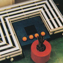
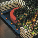
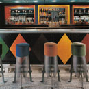
With the early 1970s comes the advent of another variation on the Repeat Repeat strategy-the use of geometric forms and visual motifs in multiple locations. Hygiene Industries, a shower curtain manufacturer, did just that with its New York showroom.9 Designer Harriette Levine styles Hygiene's space to defy the "commercial" and "ordinary" precedents established by its peers and to give its showroom a true sense of corporate identity. The unifying motif in the space is the geometry of a rounded rectangle, which evolves from the rounded corners of the space's existing front doors. This motif is then translated to display units along the space's perimeter, showcasing tasteful domestic vignettes, as well as to metal frames used as racks for hanging additional swathes of curtains. In addition to displaying products, this geometry is interpreted as a scaled down pattern for a wall covering found near the rear of the showroom. The motif also offers more than just the visual experience of display or décor. The motif also defines the spatial experience with the use of rounded rectangle archways.
Hawaii's Pearlridge Shopping center (1973) playfully disperses its brand throughout the large floor plate, making for a unified spatial experience as customers move through the corridors and common areas amongst its 170 retail spaces.10 Three concentric, colored arches make up the mall's original logo, which is suspended at regular intervals from the ceiling plane over the wide thoroughfares running through the perimeter of stores. In addition to these mobile-like expressions of the logo, which vary slightly in orientation and color to add visual interest, variations are also expressed as structural elements throughout the space. Doubling as seating areas, sculptural geometries are formed by extruding the logo's arches that dot the floor in a central atrium space, encouraging mingling and providing a point of respite. As with J. B. Ivey's department store, Pearlridge's abstracted use of its logo helps the mall solidify its own visual identity among the countless other retailers that it houses.
Across the country in upstate New York, the humble interior of the burger and sandwich shop E.A.T. is outfitted in white tiles and light wood paneling.11 Color is introduced by way of light fixtures (a vibrant teal) and hanging banners that punctuate the periphery of the ceiling plane. On these orange banners, the restaurant's moniker is spelled in capitalized teal letters. First introduced on the glass pane of the restaurant's front door, the reiteration of the name on the interior provides visual interest and rhythm to the otherwise unadorned space, leading visitors from the entry back towards the rear of the space where the service counter is located.
In a mixture of both geometric form and planar instances of Repeat Repeat, designers at RMM, Inc. make clever use of Stein Roe & Farnham's logo when crafting a space for the mutual fund.12 The logo is made of three consecutive rectangular pillars, incrementally increasing in height and all canted to the right, mimicking the italicized font that they flanked. Designers borrow the logo's geometries as the basis for the construction of partial-height wall partitions between various workspaces. The three-dimensional extrusion of the logo's basic geometric structure serves a space planning function, separating the multiple brokers' workstations. It also creates a tempoed spatial experience with the regular, rhythmic placement of the partitions while solidifying the space's sense of identity with the reiterative use of the company logo.
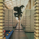
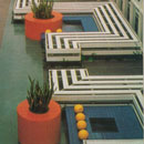
With the design of the Becton Dickinson, a medical technology company based in California, Gensler and Associates is presented with the challenge of unifying the overall campus.13 The project is a renovation, with Becton Dickinson moving into a space that once housed an old electronics production company. The existing complex consisted of three steel frame buildings connect by a central atrium. As a part of the rehabilitation, Gensler designer Christine Banks looked for way to connect the sprawling interior, settling on a series of "geometric garden elements" that dot the length of the atrium space. Three-sided square enclosures of white slats enclose "pool areas" of blue tile that are each fed by four yellow cast-concrete fountain spheres. Many of the pools of water also accommodate cylindrical red-tile planters that house lush greenery. A total of twelve of these pool areas run along the 400-foot atrium space, offering an aesthetic feast of primary color and repeated pattern. For a space as large as the Becton Dickinson headquarters, the atrium space, which connects the three buildings both literally and visually, is key to a unified experience of the overall interior.
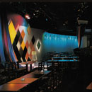
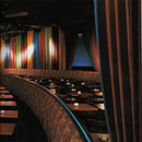
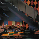
A saturated example of Repeat Repeat is found in Manhattan's Caroline's Comedy Club.14 The diamond motif, reminiscent of a colorful Harlequin (Intype),15 begins with the marquee on Broadway, making the comedy club an iconic fixture in New York City's Theater District. The Harlequin motif carries through to the minutest of elements in the interior. It is used on almost every surface possible-from the walls flanking the stage to the table-tops from which audience members can enjoy a drink while watching the show. Harlequin is even used on the restroom doors. The front panel of the bar, and the wall following the gentle curve of the staircase, showcase this bold diamond pattern. The diamonds, all rich in color, range from crimson to marigold, umber to vibrant green, and are all cast on a black background.
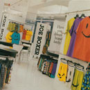
Joe Boxer is a brand name notorious for its playful, winking smiley faces and the bright colors used in its underwear line.16 Its New York City showroom, intended to be just as fun of an experience, capitalizes on the products' vibrant colors and graphics as a Repeat Repeat. Visitors are introduced to the spirited aesthetic of the space upon first entry into the showroom's lobby. Bold black and white striped ceiling fabric compliments supersized iterations of the company name, repeated on both the floor and walls. Mirrors reminiscent of a funhouse play up the lighthearted whimsy of the interior, and are carried through to the main floor of the showroom.
Joe Boxer's space itself is a White Box, letting the furnishings and products create the palette. The same bold stripes from the entryway adorne cartoonish exaggerated pieces of furniture, and the JOE BOXER name runs vertically up the panels of almost every display system. Quotes push the brand concept even further: "The brand is the amusement park. The product is the souvenir" and "Have you driven a brand lately?".
For Swiss company Vitra's Los Angeles showroom, it is the products that ultimately translate into the space's repeated graphic motif.17 The interior renovation of the two brick buildings, originally a 7,000-square-foot 1940s Air Force recruiting center, is a collaborative effort by designers at Sevil Peach Gence Associates and New York City's graphics team 2x4. The space is gutted, revealing a timber bow-truss ceiling as well as a slew of challenging spatial divisions, both in the separation of the buildings and in a twenty-eight inch disparity in elevation. For designers, the challenge is connecting two disparate buildings both physically and visually. The change in elevation is resolved with a gentle, sloping interior ramp, making for an ADA compliant solution that is both functional and aesthetically pleasing. The two buildings are joined by wood-decked patio with an overhead trellis, serving to transition between the white epoxy concrete floors of the front building to the maple flooring in the back.
In both Vitra buildings, furniture is laid out comfortably as if it were a home rather than a furniture warehouse, making the expansive interior more accessible. Without a partitioning system, other tools have to be implemented to bring order and cohesion to the space. The iconic and often sculptural furniture housed in the showroom, is translated into supergraphics that dot perimeter walls of the space, turning a Maarten van Severen .03 chair into a spiraling shell, and a Panton Heart Cone into a kaleidoscope-like circular array. These abstractions make for a consistent graphic presentation of the furniture, used throughout the space to offer a unique visual presentation of the showroom's wares.
From its humble beginnings in 1940 as a wholesale butter and egg shop, Murray's Cheese grew as an established brand, becoming a destination hotspot in New York's Greenwich Village.18 The cheese shop, which now boasts two Manhattan locations, expanded both in size and in range of services. It offers classes, catering and private events, and a three-day cheese boot camp. The flagship Greenwich location is tucked in among other food related retail stores (Amy's Bread, The Lobster Place, Faccio's Italian Specialties) on the tree-lined corner of Bleecker and Leroy. The wide array of small specialty food shops and bodegas lining the street earned the name "Sandwich Alley". Not one to get lost in a crowd, Murray's bold storefront is a standout on the street corner. A horizontal, mustard colored sign runs flush with the building's façade, reading "THIS IS MURRAY'S CHEESE". Its logo, a vivid red in a classic ballpark script, is written on a gently ascending diagonal, a wonderful contrast to the white, sans-serif block letters that surround it. Below this sign, the shop's awning borrows the red of the logo with the words "cheese" and "dairy" printed in the contrasting mustard yellow.
This initial presentation of the company's brand identity sets the stage for the palette used throughout the rest of the interior. Inside, the shop is a hubbub of all things Murray's, a mixture of clean, bold graphics, hand-lettered chalk boards and rustic wooden crates. A dropped soffit behind the deli counter was painted the bright red of the Murray's logo with large, yellow block letters filling every inch. The words offer tasty cheese descriptors (decadent, bold, lingering, savory, nutty) establishing a text-block motif used in various applications elsewhere in the store. Shelves and coolers are stacked high with every kind of cheese imaginable, each tagged with custom Murray's labels bearing the same string of colorful text found behind the deli. Even cheese paper is for sale, carefully rolled and secured with individual red and yellow Murray's ribbons. The company colors make for a saturated theme, covering every painted wall, every piece of signage, and every chalkboard frame. Given the space's relatively small size and high density of merchandise, the brand experience is even more highly saturated and sensory. Already known for being the oldest cheese shop in New York, Murray's makes and maintains a name for itself as being the best.
The bold New York flagship store for Louis Vuitton, located on the corner of 5th Avenue and East 57th Streets, offers its first colorful display of iconic brand identity prior to entering the store. Designer Jun Aoki describes the frosted glass of the multi-story façade as "a playfully sleek meditation on crystalline transparency and clouded translucency."19 The transparent and opaque alternating color blocks are reminiscent of patterns often found on Louis Vuitton textiles, and at night the facade was often lit with colorful arrays of the company monogram. This motif is carried through to the store's interior, transforming the iconic logos and graphic patterns found on the brand's textiles onto spatial elements into a saturated shopping experience.
Throughout the interior retail space, these patterns are scaled to fit various surface applications, backing display niches, covering walls, and upholstering the occasional bench. The most notable applications adorn the interior's two features-it's so-called "Wonder Wall" and "Bag Bar". The former serves as the core to the interior's staircase, climbing three stories through the center atrium of the space. Backlit cubes of alternating color, again evoking the checkered print, are etched with a variation of the circle/diamond motif that so often accompanied the monogram pattern. The wall makes a colorful statement with constantly changing spectral light, and is visible from virtually everywhere within the space. The same circle/diamond motif is also used on the store's infamous "Bag Bar". Located on the second floor overlooking the atrium, the back wall of the bar is made up of a series of cubes recessed to different depths and adorned with various iterations of the same pattern. The spot-lit cubes are affixed to motorized tracks, moving laterally to reveal merchandise hidden behind. A bar and bar stools located in front of the wall, allow customers to sit and "sample" the products displayed behind the bar. The statement feature was built custom for the store and became a staple in many other Louis Vuitton locations, allowing for a unique and personalized experience of the LV merchandise.
Repeat Repeat is one of the oldest and most utilized archetypical practices associated with Spatial Graphic Design. In the Johnson & Johnson Headquarters (Understate) and the Night Hotel (Activate), Repeat Repeat is a strategy for designing spatial experiences.20
end notes
- 1) D.H. Kelley and B. Wells, "Recent Progress in Understanding the Indus Script," Review of Archaeology 16, no. 1 (1995): 15-23.
- 2) Philip B. Meggs, A History of Graphic Design (New York: John Wiley & Sons, Inc., 1998), 162-67.
- 3) Ronald Hambleton, The Branding of America (Dublin, N.H.: Yankee Publishing Incorporated, 1987), 11-12.
- 4) Celia Lury, Brands: The Logos of the Global Economy (London: Routledge, 2004), 83.
- 5) Meggs, A History of Graphic Design, 407.
- 6) North Hills Shopping Center [1967] Lebalme Associates; Raleigh, NC in Anonymous, "Design Within Design," Interior Design 38, no. 4 (Apr. 1967): 206-207; PhotoCrd: Gil Amiaga; Matthew Beaumont, "Shopping in Utopia: Looking Backward, the Department Store, and the Dreamscape of Consumption," Nineteenth-Century Contexts 28, no. 3 (2006): 191-209.
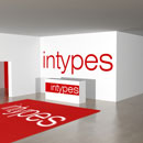
- 7) The Intype Plinth is a museum and gallery display technique that raises a three-dimensional object slightly off the floor (usually one low step). The device isolates and calls attention to the object on display. Interior Archetypes Research and Teaching Project, http://intypes.cornell.edu/intypesub.cfm?inTypeID=119 (accessed Sep. 7, 2011); Cheng, Courtney. "Theory Studies: Archetypical Showroom Practices in Contemporary Interior Design." M.A. Thesis, Cornell University, 2012, 113-36.
- 8) Vidal Sassoon [1971] Billy McCarty; New York City in Anonymous, "Vidal Sassoon's Barber Shop," Interior Design 42, no. 10 (Oct. 1971): 144-45; PhotoCrd: Louis Reens.
- 9) Hygiene Industries Showroom [1972] Harriette Levine, interior design; New York City in Anonymous, "Hygiene Industries," Interior Design 43, no. 4 (Apr. 1972): 164-67; PhotoCrd: Anonymous.
- 10) Pearlridge Shopping Center [1973] Robert P. Gersin Associates, interior design; Oahu, HI in Anonymous, "Pearlridge Shopping Center," Interior Design 44, no. 4 (Apr. 1973): 106-111; PhotoCrd: Auge Salbosa.
- 11) E.A.T. Restaurant [1979] Stockman & Manners Associates; Upstate, NY in Anonymous, "E.A.T.: In Upstate New York," Interior Design 50, no. 10 (Oct. 1979): 237; PhotoCrd: George Cserna.
- 12) Stein Roe & Farnham Funds Center [1983] RMM, Inc.; Chicago, IL in Anonymous, "Offices Under 10,000 Square Feet," Interior Design 54, no. 11 (Nov. 1983): 184-185; PhotoCrd: Howard Kaplan.
- 13) Becton Dickinson [1991] Gensler; San Francisco, CA in Monica Geran, "Becton Dickinson," Interior Design 62, no. 8 (Aug. 1991): 100-104; PhotoCrd: Nick Merrick/Hedrich Blessing.
- 14) Caroline's Comedy Club [1993] Haigh Architects; New York City in Edie Cohen, "Haigh Architects," Interior Design 64, no. 2 (Feb. 1993): 136-41; PhotoCrd: Elliott Kaufman.
- 15) The Interior Archetype Harlequin refers to a checkered pattern (alternating colored squares) oriented in a 90° or a 45° angle typically made of marble, wood, or clay tiles. It has been identified in both house and hotel practice types. http://intypes.cornell.edu/intypesub.cfm?inTypeID=1 (accessed Sep. 7, 2011); Marta Mendez, "Theory Studies: Archetypical Practices of Contemporary House Design." M.A. Thesis, Cornell University, 2008, 76-87; Nathan James Wasilewski, "Theory Studies: Archetypical Practices of Contemporary Hotel Design." M.A. Thesis, Cornell University, 2011, 55-81.
- 16) Joe Boxer New York Showroom [1999] FTL Happold; New York City in Anonymous, "That's Entertainment," Interior Design 70, no. 4 (Apr. 1999): 220-22; PhotoCrd: Elliott Kaufman.
- 17) Vitra Showroom [2003] Sevil Peach Gence Associates; Los Angeles, CA in Edie Cohen, "Vitra, Va-Va-Voom," Interior Design 74, no. 1 (Jan. 2003): 204-11; PhotoCrd: Eric Laignel.
- 18) Murray's Cheese [2011] Magdalena Keck Interior Design; New York City; Site Visit, Juliana Daily, 31 Mar. 2011; PhotoCrd: Juliana Daily, Intypes Project, 31 Mar. 2011.
- 19) Louis Vuitton [2011] Jun Aoki; New York City; Site Visit, Juliana Daily, 31 Mar. 2011; PhotoCrd: Juliana Daily, Intypes Project, 31 Mar. 2011; "Louis Vuitton Store, New York", Galinsky, accessed 18 Aug. 2011, http://www.galinsky.com/buildings/louisvuittonny/.
- 20) Evidence for the archetypical use and the chronological sequence of Repeat Repeat in Spatial Graphic Design was developed from New York City site visits to Murray's Cheese and Louis Vuitton in 2011 and from the following primary sources: 1960 North Hills Shopping Center [1967] Lebalme Associates; Raleigh, NC in Anonymous, "Design Within Design," Interior Design 38, no. 4 (Apr. 1967): 206-207; PhotoCrd: Gil Amiaga / 1970 Vidal Sassoon [1971] Billy McCarty; New York City in Anonymous, "Vidal Sassoon's Barber Shop," Interior Design 42, no. 10 (Oct. 1971): 144-45; PhotoCrd: Louis Reens; Hygiene Industries Showroom [1972] Harriette Levine, interior design; New York City in Anonymous, "Hygiene Industries," Interior Design 43, no. 4 (Apr. 1972): 164-67; PhotoCrd: Anonymous; Pearlridge Shopping Center [1973] Robert P. Gersin Associates, interior design; Oahu, HI in Anonymous, "Pearlridge Shopping Center," Interior Design 44, no. 4 (Apr. 1973): 106-111; PhotoCrd: Auge Salbosa; E.A.T. Restaurant [1979] Stockman & Manners Associates; Upstate, NY in Anonymous, "E.A.T.: In Upstate New York," Interior Design 50, no. 10 (Oct. 1979): 237; PhotoCrd: George Cserna / 1980 Stein Roe & Farnham Funds Center [1983] RMM, Inc.; Chicago, IL in Anonymous, "Offices Under 10,000 Square Feet," Interior Design 54, no. 11 (Nov. 1983): 184-185; PhotoCrd: Howard Kaplan / 1990 Becton Dickinson [1991] Gensler; San Francisco, CA in Monica Geran, "Becton Dickinson," Interior Design 62, no. 8 (Aug. 1991): 100-104; PhotoCrd: Nick Merrick/Hedrich Blessing; Caroline's Comedy Club [1993] Haigh Architects; New York City in Edie Cohen, "Haigh Architects," Interior Design 64, no. 2 (Feb. 1993): 136-41; PhotoCrd: Elliott Kaufman; Joe Boxer New York Showroom [1999] FTL Happold; New York City in Anonymous, "That's Entertainment," Interior Design 70, no. 4 (Apr. 1999): 220-22; PhotoCrd: Elliott Kaufman / 2000 Vitra Showroom [2003] Sevil Peach Gence Associates; Los Angeles, CA in Edie Cohen, "Vitra, Va-Va-Voom," Interior Design 74, no. 1 (Jan. 2003): 204-11; PhotoCrd: Eric Laignel.
bibliographic citations
1) The Interior Archetypes Research and Teaching Project, Cornell University, www.intypes.cornell.edu (accessed month & date, year).
2) Daily, Juliana Richer. "Spatial Graphic Design: Archetypical Design Practices and Theory Studies On Constructing A Narrative Of Place." M.A. Thesis, Cornell University, 2012, 23-43.