
Plinth
The Intype Plinth is a museum and gallery display technique that raises a three-dimensional object slightly off the floor (usually one low step). The device isolates and calls attention to the object on display. more
Plinth | Showroom
application
In showrooms a Plinth creates a "museum effect," calling attention to the object as special or significant. Plinths in the showroom context are arranged so that clientele can circulate around an object to view and analyze it from all angles.
research
Most often in showrooms, the Plinth takes a rectangular shape, but some examples were cylindrical or irregular in form. Plinths are commonly painted white or another neutral color, so as not to upstage the products they are displaying. Plinths made out of a different material than the rest of the space can add visual interest to an installation. In some showrooms, the Plinth takes on the same materiality of the floor, creating the illusion of one continuous surface that rises and sinks.
Architecturally, a plinth is a base or pedestal upon which a column, statue, monument, or structure rests. On the smaller end of the scale, a plinth acts as a display platform for an object, while on a larger scale it acts as a mechanism to ground a building within a landscape. Architect and art critic Gottfried Semper argued in an essay, "The Four Elements of Architecture," that this larger form of plinth, along with the hearth, the wall and the roof, was one of the four elements that composed all of architectural theory.1
In classical architecture, a plinth refers to the lowest square member of the base of a column. It is likely that the contemporary display Plinth evolved from this usage, but a more direct ancestor can be found in the Plinths traditionally used to display sculpture, as in the Musée d'Orsay in Paris. Such display bases have been in use since at least the 15th century, and have a variety of different terms. Generally, the term socle describes a base much smaller than the object is supports; pedestal is a vertical support; and plinth is a horizontal one. The evolution of this particular form of Plinth has roots in the process used to create sculpture. As sculptors created scale models in clay, wax or plaster, their work was often anchored to a wooden board that served as a working base, allowing the artist to more easily handle the delicate models. Although this board was often removed when the models were made of clay or wax, it often became an integral feature of plaster models because of the armature affixed to it. In some cases, this support board may have been retained in the final design, creating an integrated Plinth on which the sculpture could rest. However, sculptures with integrated Plinths of this kind were rare up until the early 20th century, when the "direct carving" method came into popular use with artists. This method encouraged the sculptor to carve the finished piece without the use of scale models, instead working from memory or direct observation. In this instance, the Plinth was kept as a way of indicating the original block from which the piece had been sculpted.2
Effect
In showrooms, the use of Plinths adds to the "museum effect"-imposing an authority on the viewer, by controlling how an object is seen. The simplest way Plinths contribute to the museum effect is by displaying objects. As Emma Barker explained in Contemporary Cultures of Display, "the condition of being on display is fundamental to the construction of the category ‘art' in the modern western world."3 Objects are often placed on Plinths singly, rather than in groups. This isolation removes the object from any sort of external context and suggests that the object is being displayed for "aesthetic contemplation."
Functionally, Plinths contribute to the museum effect by elevating objects off the floor, allowing people to see them more easily, sometimes at eye-level. As exhibition designer James H. Carmel explains, if people gather around a display such that a deep enough crowd is created, the object "should not be placed lower than shoulder height." This elevation of the object also varies the landscape of the floor, avoiding "the tyranny of the rectangular room,"4 that occurs when exhibition spaces create monotonous arrangements of objects using only the four walls of a space.
Spatially, Plinth is an elevation of a portion of the base plane or floor; it defines an area within a larger spatial context. The boundaries of a Plinth's space are defined by the level change that occurs at its edge. If the Plinth is made of the same material as the base plane, then the Plinth will appear to be "very much a part of the surrounding space." Depending on its height, the Plinth may read as a continuous articulation of the floor, creating the illusion of one coherent surface that rises and sinks. However, if the Plinth is a different color or texture than the base plane, then the spatial field it creates will "become a plateau that is separate and distinct from its surroundings."5 This serves to highlight objects on display, because the different materials visually punctuate their locations.
The surface area of the Plinth will influence how it interacts with the space. A Plinth that takes up a relatively large amount of floor space in a room will more likely be perceived as an extension of the base plane. However, a Plinth that takes up a very small amount of floor space will more likely be seen as a type of display pedestal. If there are multiple Plinths of this type within one space, this effect is exaggerated. Of course, the size of the Plinth in relation to the object being displayed is also significant. If the surface area of the display surface is comparable in size to the object being displayed, the Plinth tends to read more as a display pedestal for that particular object. However, if the display surface is remarkably larger than is necessary for the object or vignette6 of objects, it may seem more like another floor plane rather than a display surface.
The height of a Plinth will also affect how it interacts with a space. A low Plinth maintains the visual and spatial continuity of the larger space; people can easily see over it, and are not physically hindered from climbing up on to its surface.7 However, if the Plinth is higher than the average height of a stair riser (seven to nine inches), people may be subconsciously discouraged from attempting to step onto the platform. Taller Plinths may still maintain the visual continuity of the space if the object being displayed does not significantly block the view. Taller Plinths also begin to interrupt the spatial continuity of the space, as their edges-and sometimes the product being displayed-start being perceived as vertical elements that define a space.
All these factors affect how people perceive and interact with Plinths in showroom spaces. Because a Plinth is the traditional base for a Vitrine, its edges often act as an implied barrier around the object being displayed. However, this effect is dependent on the Plinth's height and display area. In general, people are more likely to respect the boundaries of a taller Plinth whose display area is similar in size to that of the object it is displaying. In this instance, the Plinth reads as a base for a fitted display case, and visitors to the showroom are subtly discouraged from interacting with the object even if they are allowed to do so. But if a Plinth is lower (no higher than one step) and the display surface is significantly larger than is warranted for the object on display, showroom patrons may ignore the implied boundaries of the Plinth in order to get a better look at the merchandise. This stems not only from the effect of the differently sized Plinths, but also from the practice type.
The associations of the museum effect keep Plinths from being used exclusively as a design strategy in showrooms. To do so would be detrimental to the business of a company. Showrooms are places where buyers come to examine and try out different products; a room full of objects on Plinths, while attractive, does not provide the visitor with an opportunity to test the merchandise. For this reason, Plinths are most often used in combination with floor-level vignettes. This mixing of strategies allows the product to be elevated as a design piece, while still allowing the patron to interact with it.
Chronological Sequence
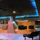
Plinth was not a particularly popular display strategy in early showrooms, because it required that a finite amount of floor space be left clear for circulation. Thus, the strategy could only be accommodated in larger showrooms, which were relatively infrequent up until the late 1960s. Furniture manufacturer Herman Miller was one of the few companies to acquire a large showroom early on. Their 1959 San Francisco showroom was designed in a colorful 1907-era building. To mediate the stylistic differences between the vibrantly colored building and the contemporary furniture and fabrics on display, the "original structure concepts" and details like "original plaster frieze work" were incorporated into the final design of the space. The color scheme was developed "according to the mood of the existing building," and included purple, red, orange, blue and gold. To distinguish between the furniture groupings, each display emphasized one of the colors. Meanwhile, at the center of the showroom, a Plinth designed to resemble a "fantasy carousel" was the main "stage-like display unit."8 Unlike the other displays, which were set up as vignettes at floor level, the carousel-like Plinth elevated the product above the floor, dramatizing the display, and drawing the visitors' eyes to it.
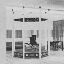
The Thonet showroom (1960) designed by Felix Augenfeld was similarly large. The showroom itself was broken up into three distinct areas: a reception area, a central gallery (for the display of current models), and a special display section that functioned as a "small historical museum." The historical models of the Thonet chairs originating from the century between 1830 to 1930 were arranged on two plinths covered in yellow vinyl against a white background. A Billboard9 (Intype) consisting of a blowup of "an old Thonet catalog page" marked one end of the small museum space, designed to catch the attention of visitors and to encourage them to walk through the small display area. Here, the Plinths acted as a mechanism for elevating the product, not only literally, but also figuratively. The displays of current furniture pieces were arranged in floor-level vignettes separated by translucent draperies or wood partitions,10 thus allowing patrons to walk around and interact with all sides of the furniture pieces. This method allowed and encouraged visitors to test out the furniture for themselves. The Plinths in the historical exhibit area, however, were arranged against the wall, meaning that visitors could only experience these pieces from certain pre-defined angles. Additionally, the level change discouraged visitors from attempting to sit in the historical pieces, clearly marking the chairs as objects of display only.
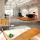
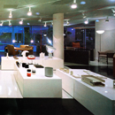
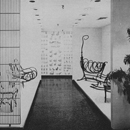
Architect Warren Platner used similar reasoning in 1968 when he designed the Georg Jensen New York City. Platner conceived the space as a museum-like White Box11 (Intype) to remove all external distractions from the showroom. Select furniture pieces were exhibited on Plinths of different materials "for eye-level viewing." Each exhibit featured the work of a different designer, and the material of the Plinth changed accordingly; the schemes included Portuguese marble, Plexiglas, white oak and Canadian granite. Each display was also arranged differently; chairs by Borge Mogensen were set "against a background mural of a Danish forest," while Poul Kjærholm's Triennale's lounge chair featured a lambskin rug and the branches of a tree. However, because the installation was a showroom and not a museum, these exhibits were complimented by rooms off to the side of the central gallery, which showed the furniture pieces in the contexts of rooms.12 Although the central museum-like gallery was the focus of the space, customers came to showrooms to test and experience the product.
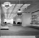
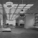
In 1970, Warren Platner designed another showroom, for Steelcase this time, and he utilized many of the same design principles he had used two years earlier for the Georg Jensen showroom. Like the Jensen showroom, Platner created a space primarily for exhibition, asserting, "How products are seen is of importance." He did not want to "suggest interiors where these objects might be used," instead opting to create "simple, clearly understandable space which would display furniture as individual objects." To achieve this, desks and tables were arranged to "float" on twenty-two glass Plinths dispersed around the showroom. Chairs were encased in glass cubes, embodying a very pure expression of Vitrine.13 Platner's effort to demonstrate how Steelcase's products were "manufactured and marketed" resulted in a presentation room in which a temporary display was set up on a semi-circular Plinth, showing a sample office chair and its underside.14 In this installation the Plinths (with the exception of the one in the presentation room) were all glass, elevating the product to eye-level with the least amount of visual intrusion possible.
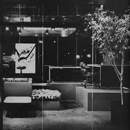
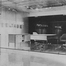
Plinth was used again as a display strategy in the 1975 Knoll showroom. In previous showrooms, the company had opted for the "vignette technique with settings accented by bright splashes of color." However, designer Robin Jacobsen decided to forgo that strategy in favor of a "more ‘severe' museum/gallery type of display." To achieve this, a Black Out15 (Intype) space was designed, creating a dramatic space where all attention was drawn to the product on display. Instead of furniture vignettes, individual pieces were put on either "display cubes" or Plinths of differing heights in the center of the showroom. This particular method of display was chosen not only because it reinforced the gallery-like feeling Jacobsen wanted to create, but also because of the flexibility the set up offered. As Jacobsen explained, "Furniture can be taken out on consignment without disrupting an entire setting; all we have to do is remove the display cube or replace the piece with something else."16 When the furniture was arranged in vignettes, it is much more obvious when something is missing; pieces cannot necessarily be replaced because whatever is on hand might not necessarily fit into the vignette. Additionally, when changing displays, the entire vignette would need to be swapped out and changed, not just one piece. The multiple Plinths and gallery-style display allowed products to be swapped in and out individually, as a curator might do in a museum.
By the decade of 1980, designers began to experiment with the expression of Plinth in showrooms. Although tradition had them fading into the background as they were painted the same color as the floor, or an otherwise neutral color, Plinths were now contributing to the spatial manipulation of the space, and appearing in a variety of colors and shapes. The Seymour Mirrow showroom in 1980 did not experiment so much with the Plinth itself, but instead experimented with the space. Plinth was typically found in museum-like exhibition spaces. This often meant that these spaces were very restrained in design, and were often painted one neutral color. In these spaces, Plinths matched either the floor or the walls, making them effectively fade into the background. The Seymour Mirrow showroom, however, was not designed to evoke a museum or art gallery. Designer Sally Walsh divided the rectangular space into a "grid of nine ‘rooms' defined by red yachting rope strung between the ceiling and the floor." The square spaces were tiled in opposite colors-"one space black, one space white"- creating a giant checkerboard effect.17 Most displays were arranged in vignettes on the floor, but the smaller items were positioned on white Plinths, whose edges were aligned with the edges of the "rooms". Here, the plinths defined the edges of the implied spaces, while at the same time, displaying smaller products closer to eye-level. However, because the small products were too small to be at eye-level, a somewhat informal display was created, inviting patrons to pick up and examine the objects.
Similarly, the Krueger showroom (1985) departed from the museum-like showroom spaces of previous decades. This particular installation was a redesign of a previous Krueger showroom, and the aim this time around was to "gain the maximum amount of change for the minimum amount of money". To do this, designer Eric Bartelt used only minimal architectural alterations, preferring to create changes using "mainly display techniques." The showroom was segmented with panels of "black Fiberglas scrim" that could be rolled up when not needed. A green "sports carpet" was laid down; its zig-zag edge led one deeper into the showroom, where pink office carpeting took over. On top of the green turf was a red plastic laminate-covered Plinth called the "splash" because of its freeform shape.18 This was placed right at the front of the showroom in the display windows, and was used to showcase new products. The complementary coloring of the green carpet and the red Plinth worked together to create the maximum amount of visual contrast. Additionally, the freeform shape of the Plinth was unlike the traditional rectangular Plinths used in most installations, suggesting a more informal type of exhibit with its curvy, unpredictable shape.
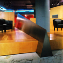
The large Plinth in the 1991 Brayton showroom created a "fixed focal point" and a "distinct circulation path that moved one around rather than through the space." The old showroom was "bright, white, open and rather directionless." Designers Larry Berger and Michael Rait remedied that with the redesign in which a large wooden Plinth occupied most of the showroom's central area. This Plinth was "intersected by a pyramid of stainless steel" and further divided by "plywood backdrops" that partitioned the Plinth into quadrants. This created smaller sections on the Plinth, so that vignettes of furniture could be displayed on it. To direct circulation, the platform was rotated slightly, so that is was aligned neither with the front entrance, nor any of the interior walls.19 This directed circulation gently around the room in a counter-clockwise direction. However, the large Plinth and the shapes intersecting it, did not encourage patrons to interact with the furniture displayed. To do so, visitors would be required to climb up on the Plinth. Moreover, to visit another vignette, they would need to climb down and then climb back up again, as the steel pyramid and plywood partitions did not allow immediate access to other vignettes. The feeling of being on display themselves discouraged clients from interacting with the furniture on the Plinth, which may explain why single pieces of furniture were scattered haphazardly around the showroom.
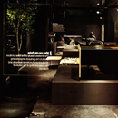
In 1999 the Geiger Bricker showroom, located with the company's case-goods manufacturing plant, was designed to be flexible. Concrete walls and the steel-beamed ceiling were exposed to focus on the product, rather than on the architecture of the space. To partition the space, "translucent mesh panels" were hung from the ceiling. Vignettes featuring "different office scenarios"20 were housed within these exhibit areas, which allowed visitors to interact with the product and to see how different pieces might come together. In the center of the showroom, a long, narrow, wooden plinth featured an alternating line of end tables and chairs. The Plinths long, narrow shape drew visitors along the length of the space. In this installation, the Plinth was clearly not the focal display in the showroom; instead it provided a method of subtly influencing circulation.
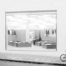
In 2003 the London B&B Italia showroom took a more informal approach in its use of Plinths. The building, designed by architect John Pawson had to meet the demands of an awkwardly shaped site, resulting in a long and thin, but very tall space that featured split-levels and a curved ceiling that made exhibition design complicated. It required interior designer Antonio Citterio to create an installation that adapted to awkward sizes and placements. The solution was to keep it simple, allowing materials, such as limestone, slate, varnished oak and white painted plasterwork, to provide subtle backdrops. The furniture was arranged into "atmospheres," or vignettes, based on living areas. There were displays of sleeping areas, living areas, dining areas, and kitchen/breakfast areas. On the main floor, these vignettes are placed on low Plinths made of dark stained oak.21 These highlighted the areas on display, visually separating one from other, smaller displays without Plinths. However, unlike in previous installations, these Plinths were low enough that customers did not feel discouraged from interacting with the vignette on display. In this case, the Plinths read almost as areas rugs instead of display pedestals.
The Steelcase Work Life Center (2008) took a similarly informal view about Plinths. The space, designed by the Shimoda Design Group, required the accommodation of its subsidiary brands-Turnstone, Nurture and Details. The design team aimed to "unify and celebrate the diversity in each company, but still allow the emergence of a holistic physical appearance." The different areas shared a wall of "sinuous glass, a dozen columns of glass fiber-reinforces columns, and the "Body," a glass fiber-reinforced cast sculpture of interconnected diamond shapes."22 Each brand has its own area within the showroom floor, and from the main entryway, these areas appeared as if they were arranged on Plinths, slightly elevated above the showroom floor. The Plinths, however, took up so much floor space, that if one entered the display area, one would not truly feel as if one were on a Plinth. When one entered the space, this tactic elevated the displays to eye-level, and encouraged visitors to explore and interact with the displays up-close.
Due to its inherent flexibility, it is likely that Plinth will continue to be a staple of showroom display strategy for decades to come.23
end notes
- 1) Gottfried Semper, "The Four Elements of Architecture," in The Four Elements of Architecture and Other Writings, trans. Harry Francis Mallgrave and Wolfgang Herrman (Cambridge: Cambridge University Press, 1989), 74-129.
- 2) Sir Banister Fletcher, A History of Architecture, 19th Ed., ed. John Musgrove (London: Butterworths, 1987), 1538; Nicholas Penny, "The Evolution of the Plinth, Pedestal, and Socle," in Collecting Sculpture in Early Modern Europe, ed. Nicholas Penny and Eike D. Schmidt (New Haven: Yale University Press, 2008), 461-62.
- 3) Valerie Casey, "The Museum Effect: Gazing from Object to Performance in the Contemporary Cultural-History Museum," (Paper presented at the annual International Cultural Heritage Meeting, Paris, France, September 8-12, 2003), 2; Emma Barker, ed., Contemporary Cultures of Display (New Haven: Yale University Press, 1999), 13-15.
- 4) James H. Carmel, Exhibition Techniques, Travelling and Temporary (New York: Reinhold Publishing Corporation, 1962), 29; Edward P. Alexander, Museums in Motion: An Introduction to the History and Function of Museums (Nashville: The American Association for State and Local History, 1979), 180-81.
- 5) Francis D.K. Ching, Architecture: Form, Space and Order (New York: John Wiley & Sons, Inc., 1996), 102-109.
- 6) In the showroom context, a vignette describes a display technique in which items are staged in scenes to suggest how customers might use them.
- 7) Ching, Architecture, 102-109.
- 8) Herman Miller Showroom [1959] Alexander Girard, architect; San Francisco, CA in Anonymous, "Showrooms," Interior Design 30, no. 4 (Apr. 1959): 184-185; PhotoCrd: Anonymous.
- 9) The Intype Billboard describes a treatment for an entire planar surface as a blank canvas for art, text, graffiti or photography. In some cases Billboard encompasses more than one plane. Jasmin Cho, "Theory Studies: Archetypical Practices of Contemporary Restaurant Design," (MA Thesis, Cornell University, 2009), 136-151; Elizabeth O'Brien, "Material Archetypes: Contemporary Interior Design and Theory Study," (M.A. Thesis, Cornell University, 2006), 109-131; The Interior Archetypes Research and Teaching Project, http://www.intypes.cornell.edu/intypesub.cfm?inTypeID=57 (accessed Oct. 14, 2011).
- 10) Thonet Showroom [1960] Felix Augenfeld, architect; New York City in Anonymous, "Market Spotlight," Interior Design 31, no. 2 (Feb. 1960): 52; PhotoCrd: Anonymous.
- 11) The Intype Vitrine describes a glass showcase for the display of significant or ordinary objects. Kristin Malyak, "Theory Studies: Archetypical Retail Practices in Contemporary Interior Design" (M.A. Thesis, Cornell University, 2011), 232-95; The Interior Archetypes Research and Teaching Project, http://intypes.cornell.edu/expanded.cfm?erID=196http://www.intypes.cornell.edu/intypesub.cfm?inTypeID=126 (accessed Oct. 14, 2011).
- 12) Steelcase Showroom [1970] Warren Platner, architect; Chicago, IL in Anonymous, "Through a Looking Glass," Interior Design 41, no. 5 (May. 1970): 110-113; PhotoCrd: Anonymous.
- 13) The Intype Black Out describes an interior space or room entirely consisting of black shades for walls, floors, ceilings and furnishings. Courtney Cheng, "Theory Studies: Archetypical Showroom Practices in Contemporary Interior Design" (M.A. Thesis, Cornell University, 2012), 70-90; The Interior Archetypes Research and Teaching Project, http://www.intypes.cornell.edu/intypesub.cfm?inTypeID=73 (accessed Oct. 14, 2011).
- 14) Knoll Showroom [1975] Robin Jacobsen, architect; Philadelphia, PA in Anonymous, "Knoll's Philadelphia Showroom," Interior Design 46, no. 1 (Jan. 1975): 102-105; PhotoCrd: Jaime Ardiles-Arce.
- 15) Seymour Mirrow Showroom [1980] Sally Walsh, architect; Houston, TX in R.P., "Seymour Mirrow & Company," Interior Design 51, no. 6 (Jun. 1980): 222-223; PhotoCrd: Jaime Ardiles-Arce.
- 16) Krueger Showroom [1985] Eric Bartelt, architect; Los Angeles, CA in Andrea Loukin, "Krueger, LA," Interior Design 56, no. 10 (Oct. 1985): 48-49; PhotoCrd: Fritz Taggart.
- 17) Brayton Showroom [1991] Larry Berger & Michael Rait, architects; New York City in Edie Lee Cohen, "Brayton," Interior Design 62, no. 1 (Jan. 1991): 118-21; PhotoCrd: Mark Ross.
- 18) Geiger Brickel Showroom [1999] Thom Williams, architect; Atlanta, GA in Julia Lewis, "Industrial Chic," Interior Design 70, no. 7 (Apr. 1999): 86; PhotoCrd: Ryan Rizzo.
- 19) B&B Italia Showroom [2003] John Pawson & Antonio Citterio, architects; London, England in Hugh Pearman, "B&B Italia," Architectural Record 191, no. 3 (Mar. 2003): 209-12; PhotoCrd: Collage Studio/CR&S B&B Italia.
- 20) Steelcase Work Life Center [2008] Shimoda Design Group, architect; Chicago, IL in Nicholas Tamarin, "Best of Year Showroom," Interior Design 79, no. 15 (Dec. 2008): 156; PhotoCrd: Benny Chan (Fotoworks).
- 21) Evidence for the archetypical use and the chronological sequence of Plinth in the showroom practice type was developed from the following sources: 1950 Herman Miller Showroom [1959] Alexander Girard, architect; San Francisco, CA in Anonymous, "Showrooms," Interior Design 30, no. 4 (Apr. 1959): 184-185; PhotoCrd: Anonymous / 1960 Thonet Showroom [1960] Felix Augenfeld, architect; New York City in Anonymous, "Market Spotlight," Interior Design 31, no. 2 (Feb. 1960): 52; PhotoCrd: Anonymous; Georg Jensen Showroom [1968] Warren Platner, architect; New York City in Anonymous, "Showcase for Showrooms," Interior Design 39, no. 7 (Jul. 1968): 74-77; PhotoCrd: Ezra Stoller / 1970 Steelcase Showroom [1970] Warren Platner, architect; Chicago, IL in Anonymous, "Through a Looking Glass," Interior Design 41, no. 5 (May. 1970): 110-113; PhotoCrd: Anonymous; Knoll Showroom [1975] Robin Jacobsen, architect; Philadelphia, PA in Anonymous, "Knoll's Philadelphia Showroom," Interior Design 46, no. 1 (Jan. 1975): 102-105; PhotoCrd: Jaime Ardiles-Arce / 1980 Seymour Mirrow Showroom [1980] Sally Walsh, architect; Houston, TX in R.P., "Seymour Mirrow & Company," Interior Design 51, no. 6 (Jun. 1980): 222-23; PhotoCrd: Jaime Ardiles-Arce; Krueger Showroom [1985] Eric Bartelt, architect; Los Angeles, CA in Andrea Loukin, "Krueger, LA," Interior Design 56, no. 10 (Oct. 1985): 48-49; PhotoCrd: Fritz Taggart / 1990 Brayton Showroom [1991] Larry Berger & Michael Rait, architects; New York City in Edie Lee Cohen, "Brayton," Interior Design 62, no. 1 (Jan. 1991): 118-121; PhotoCrd: Mark Ross; Geiger Brickel Showroom [1999] Thom Williams, architect; Atlanta, GA in Julia Lewis, "Industrial Chic," Interior Design 70, no. 7 (Apr. 1999): 86; PhotoCrd: Ryan Rizzo / 2000 B&B Italia Showroom [2003] John Pawson & Antinio Citterio, architects; London, England in Hugh Pearman, "B&B Italia," Architectural Record 191, no. 3 (Mar. 2003): 209-212; PhotoCrd: Collage Studio/CR&S B&B Italia; Steelcase Work Life Center [2008] Shimoda Design Group, architect; Chicago, IL in Nicholas Tamarin, "Best of Year Showroom," Interior Design 79, no. 15 (Dec. 2008): 156; PhotoCrd: Benny Chan (Fotoworks).
bibliographic citations
1) The Interior Archetypes Research and Teaching Project, Cornell University, www.intypes.cornell.edu (accessed month & date, year).
2) Cheng, Courtney. "Theory Studies: Archetypical Showroom Practices in Contemporary Interior Design." M.A. Thesis, Cornell University, 2012, 113-36.